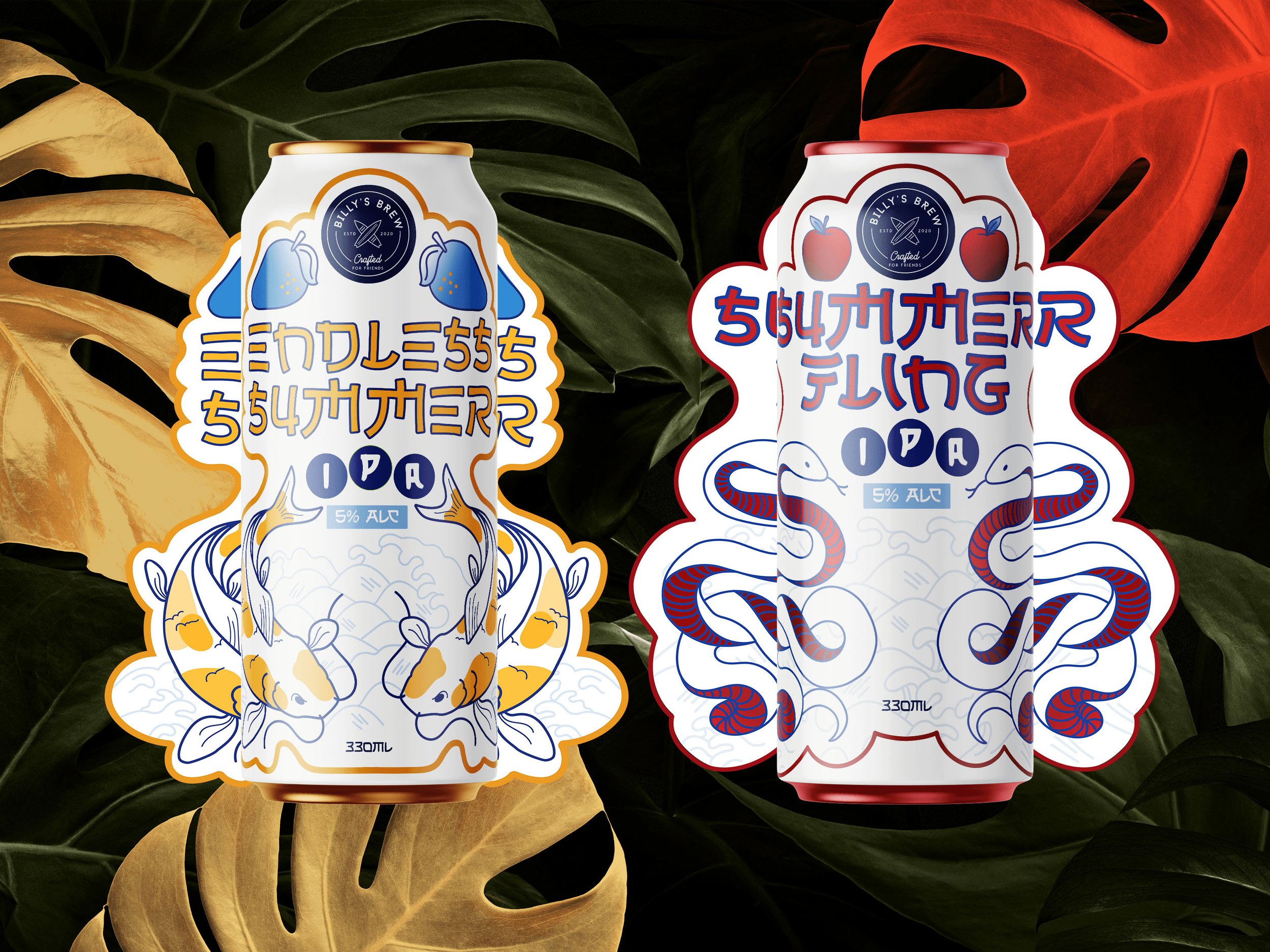
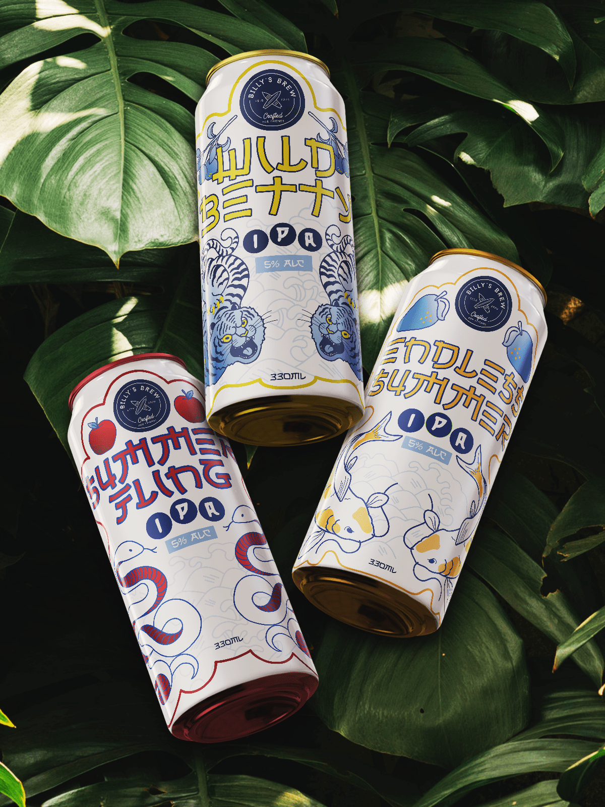
Bold Flavours, Bold Design – Where IPA Meets Asian-Inspired Packaging
Create three potential beer can designs for Billy’s Brew, a Noosa brewery focused on bringing people together. The designs needed to reflect the bold, fruity flavour of an IPA and suit a coastal lifestyle.
01) The Brief
Billy’s Brew needed packaging that felt unique, recognisable, and different from other craft beer brands, while still capturing Noosa’s laid-back coastal culture.
02) The Problem
03) The Solution
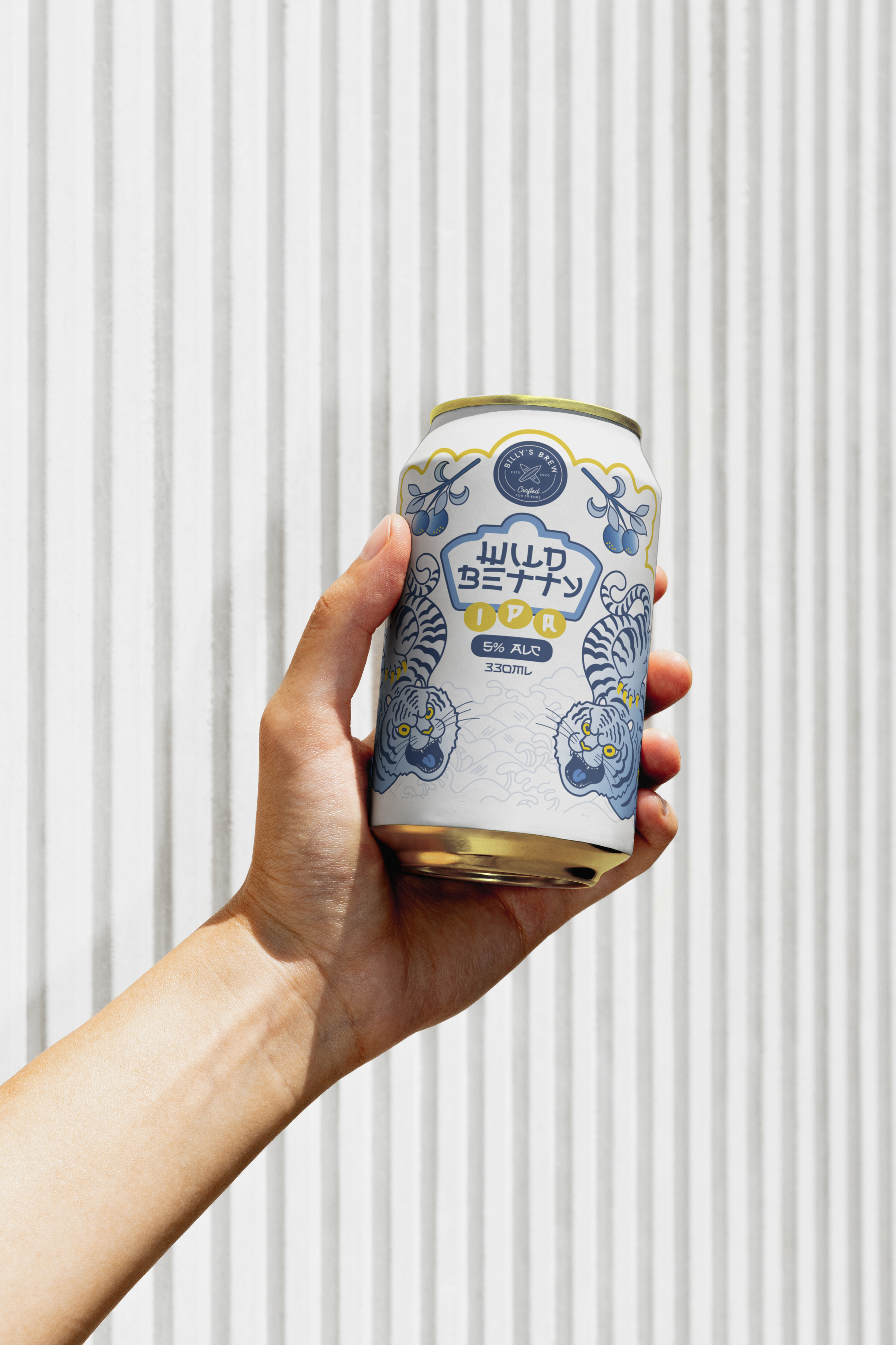
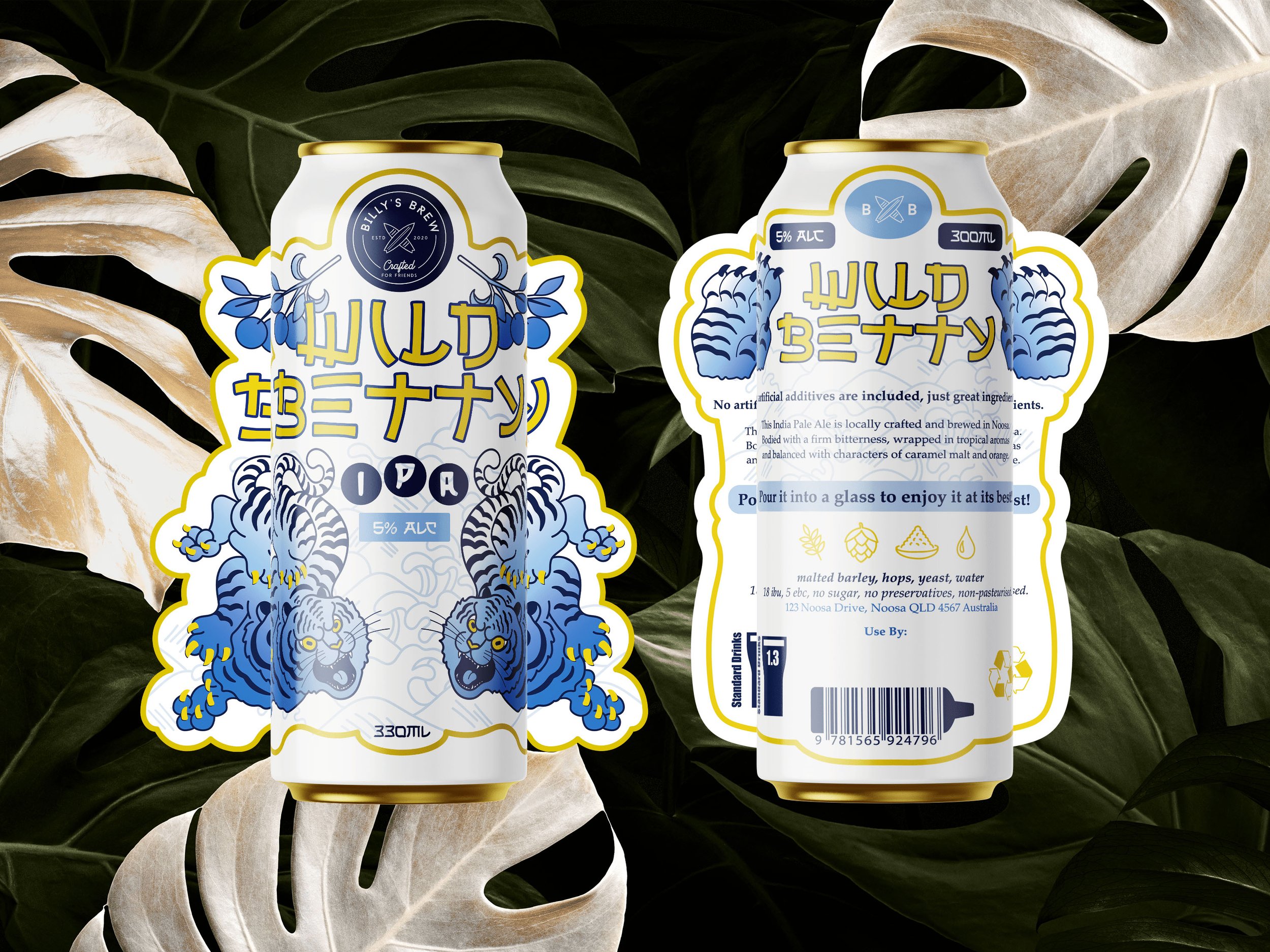
I researched Noosa, IPA flavours, craft beer packaging, and competitors to create an illustrative tattoo-inspired design. This helped the cans feel bold, coastal, and memorable while building a strong brand identity.
04) Photos & Process below
This project was selected as a finalist in two categories—Student Design Crafts and Student Packaging—at the 2024 Australian Graphic Design Association (AGDA) awards and won Merit under ‘Student Packaging’. It has also been submitted by Torrens University for consideration in the 2025 Indigo Awards.
https://agda.com.au/awards/results/6089/ (Packaging - Merit)
https://www.indigoaward.com/winners/10485 (Packaging - Silver)
https://www.indigoaward.com/winners/10484 (Illustration - Gold)
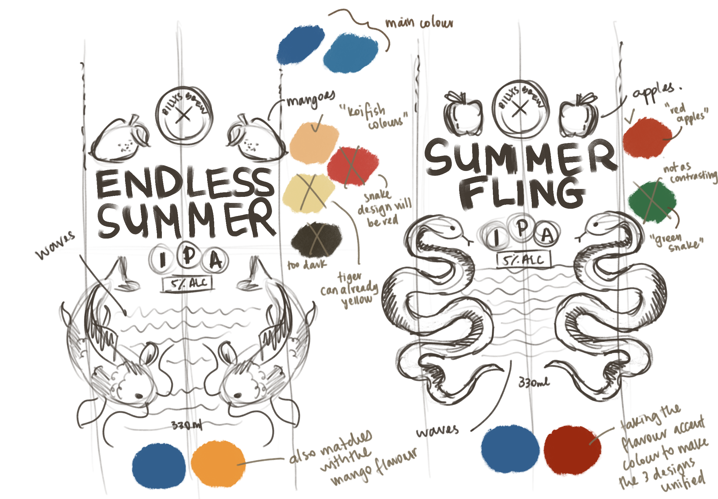
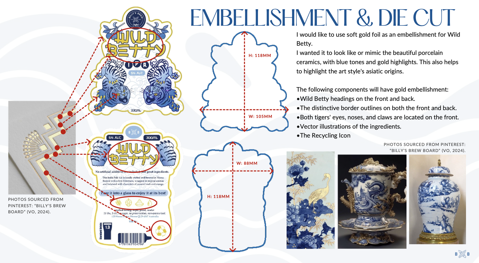
The images below showcase my initial sketches and the thought process behind the packaging design. This is just a glimpse of the work that went on behind the scenes, including research into local beer packaging trends. I noticed that illustrative designs were rare, with many opting for typemark-focused packaging. I wanted to challenge that trend while staying true to the brief and highlighting my unique style as a graphic designer.